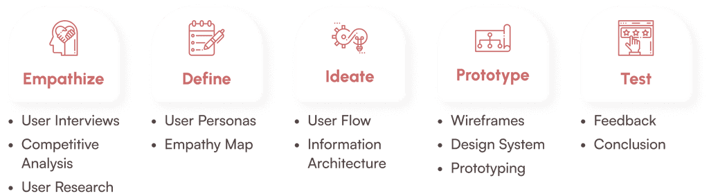
UX/UI Case Study
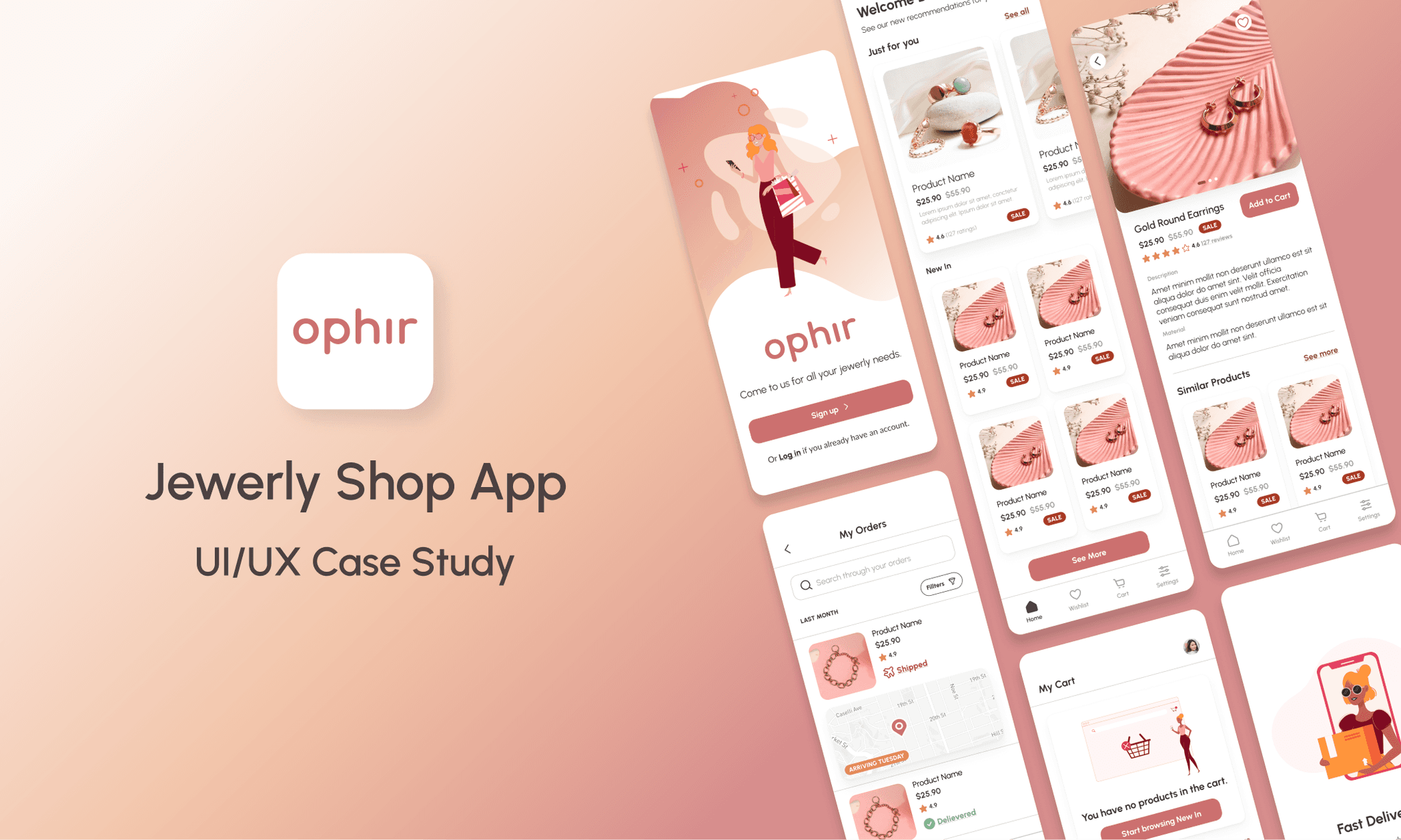
Ophir - Jewerly Shop App
ROLE
UX/UI Designer
EXPERTISE
UX/UI Design
YEAR
2022
Ophir is a jewelry app that offers huge varieties of all kinds of designs and suitable for all occasions. The app is individually connected to the user and offers special offers and finds based on interests. In addition to this, it has a wide variety of articles related to jewelry and ways to combine it.
Timeline
The project was completed over the course of 3 months, from initial research and wireframes to final designs.
People often waste time searching for the perfect jewelry by visiting multiple physical shops, only to find limited options or none at all, forcing them to browse clothing stores in search of accessories. In physical stores, there’s no way to check customer feedback, making it harder to evaluate the quality or popularity of a piece, and it can feel uncomfortable when a salesperson is watching your every move. If you find a piece you like, you may feel pressured to buy it right away, since it could be sold out by the time you return.
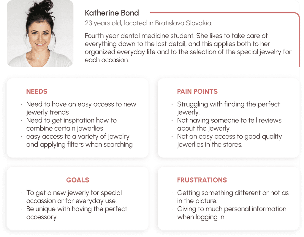
Persona
Based on the taken data an example of persona was created.
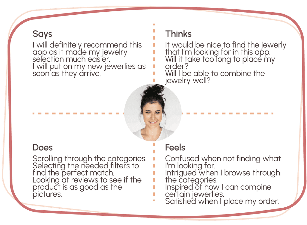
Empathy map
It was created to be able to deeply understand the problems and emotions of the user when visiting the application and to try and find their solutions.
User flows
User flows were created in order to better understand the direction that a new user would take.
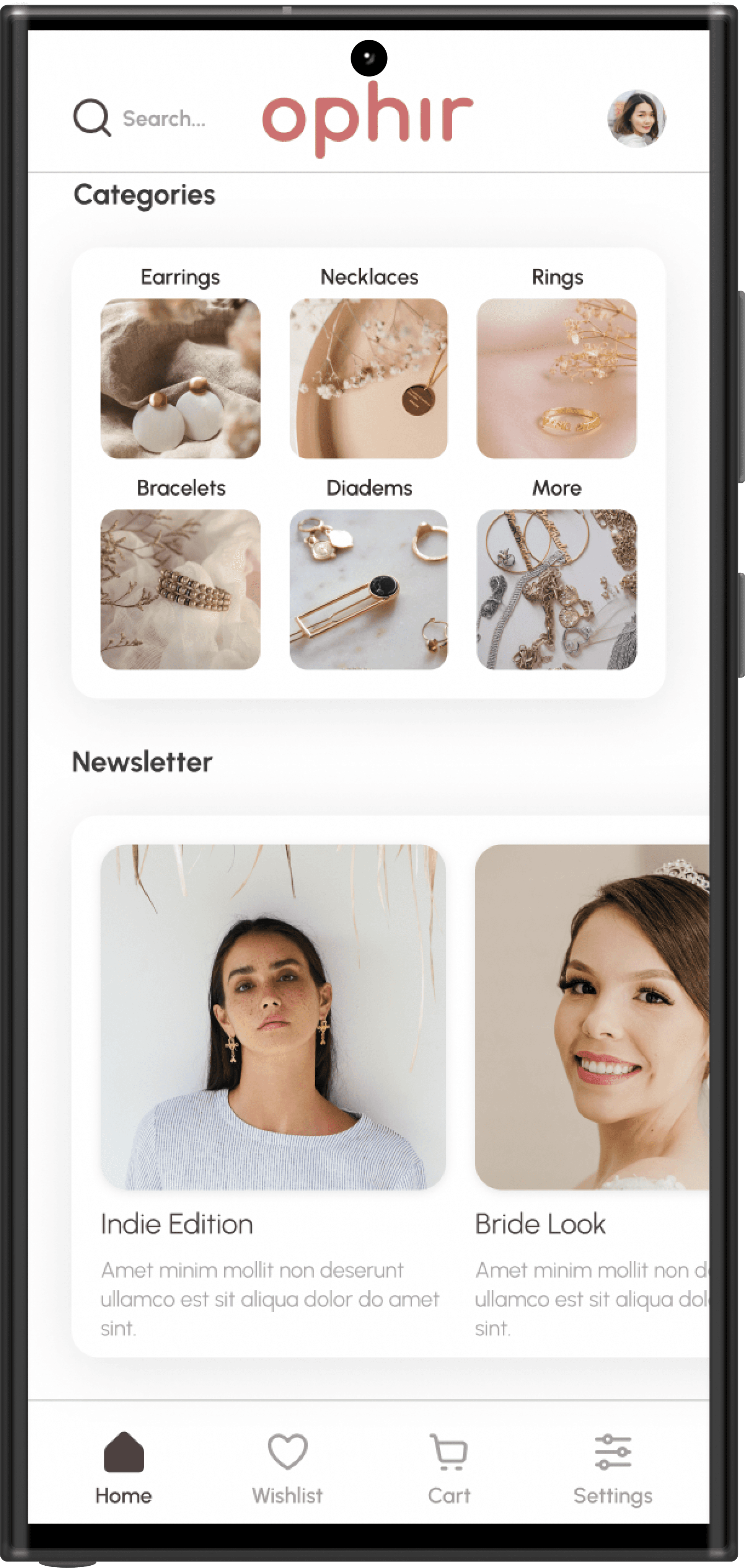
The information architecture of the jewelry mobile app outlines the core structure and navigation paths. Users begin with onboarding and can either sign up or log in to access the home screen. From the home screen, they can search for products, view their profile, explore new arrivals, browse categories, manage their wishlist, access their cart, or change settings. Each section provides further options, such as filters for search and categories, order management within the profile, and secure checkout from the cart. The structure is designed to provide an organized and intuitive flow through the app's features.
Prototype
Low-fidelity wireframes
Low-fidelity wireframes were created to represent the main path of the application usage. After the wireframes were made, they were given to a group of people to test and give feedback on the app's functionality and layout. Information was extracted that served to improve the developed UI design, which was implemented in the final prototype.
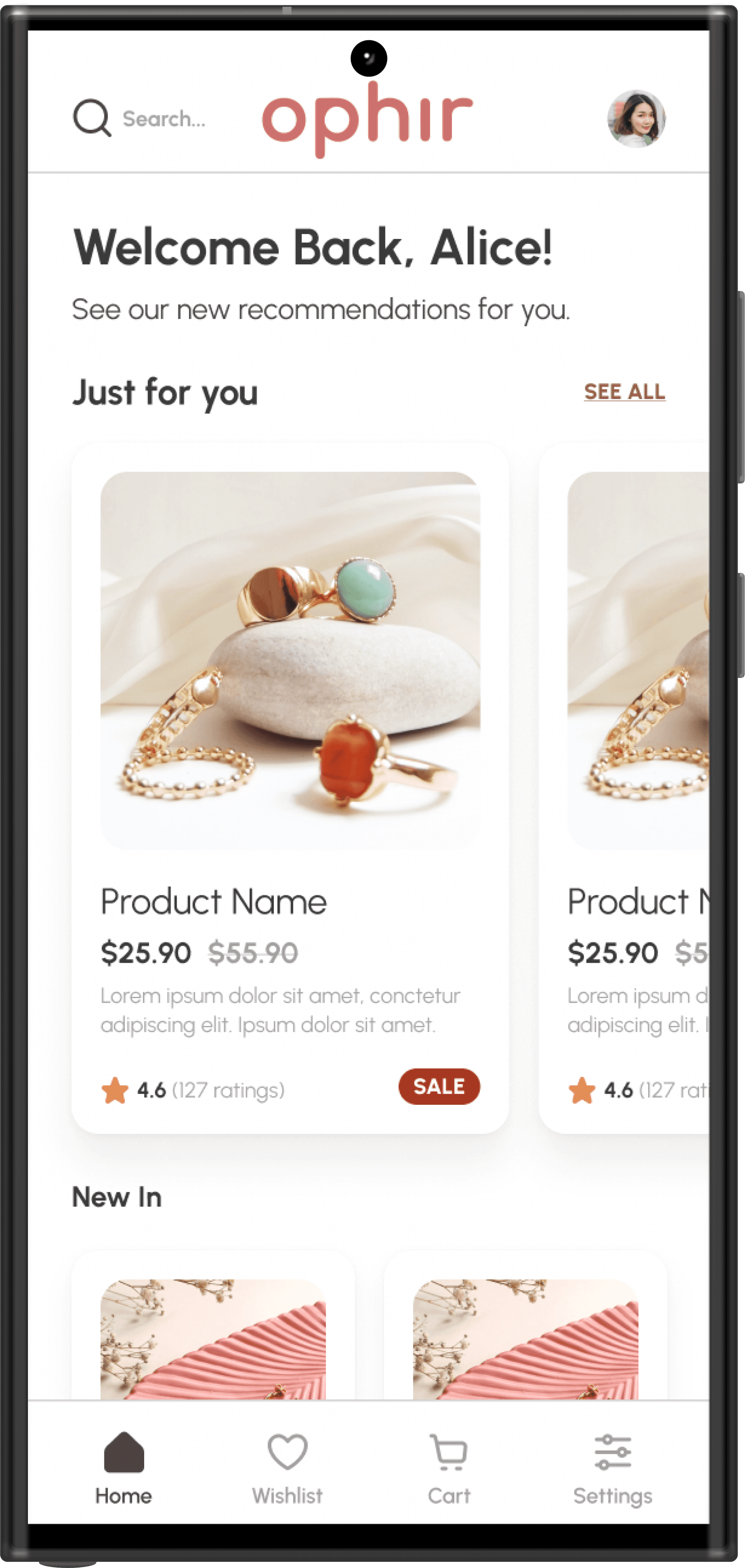
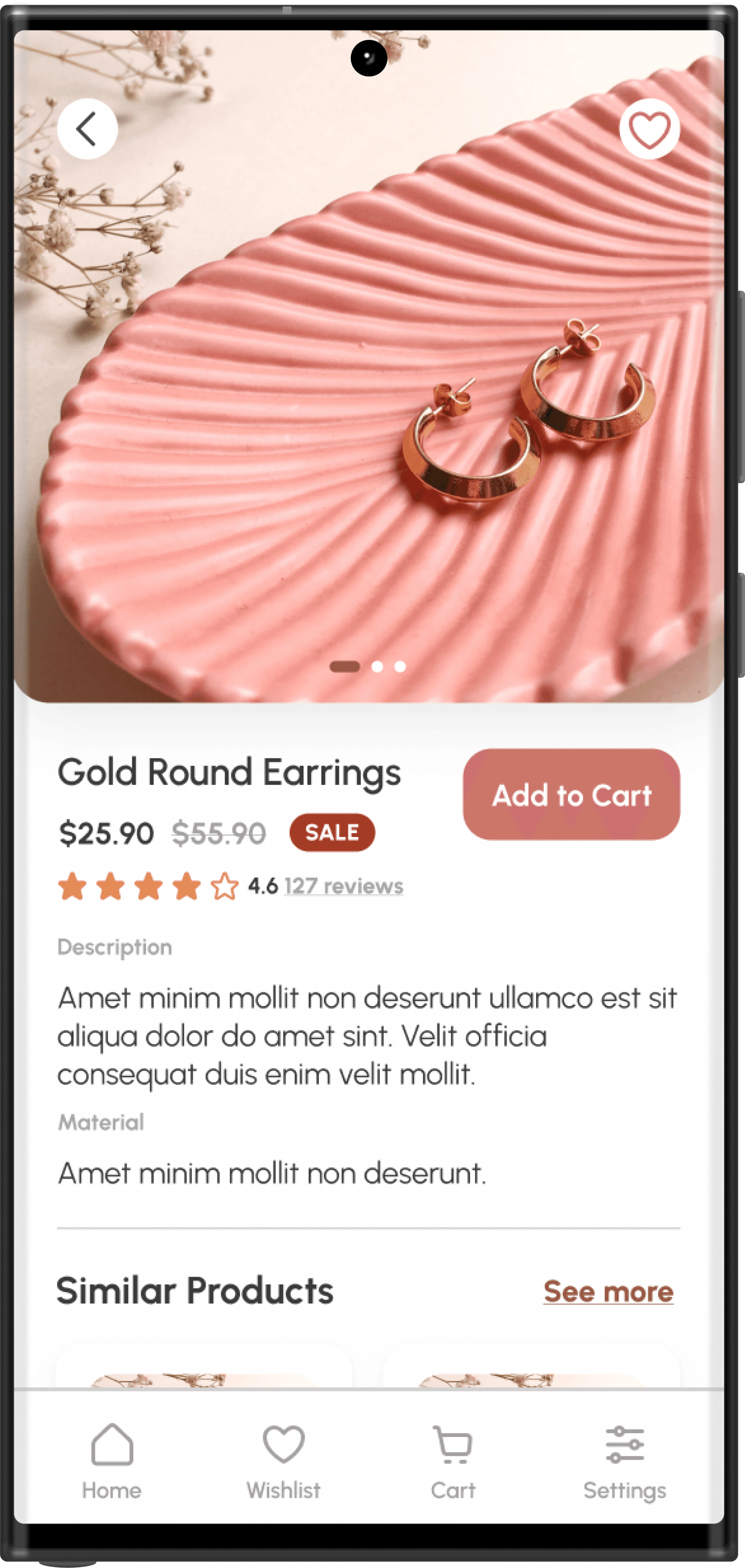
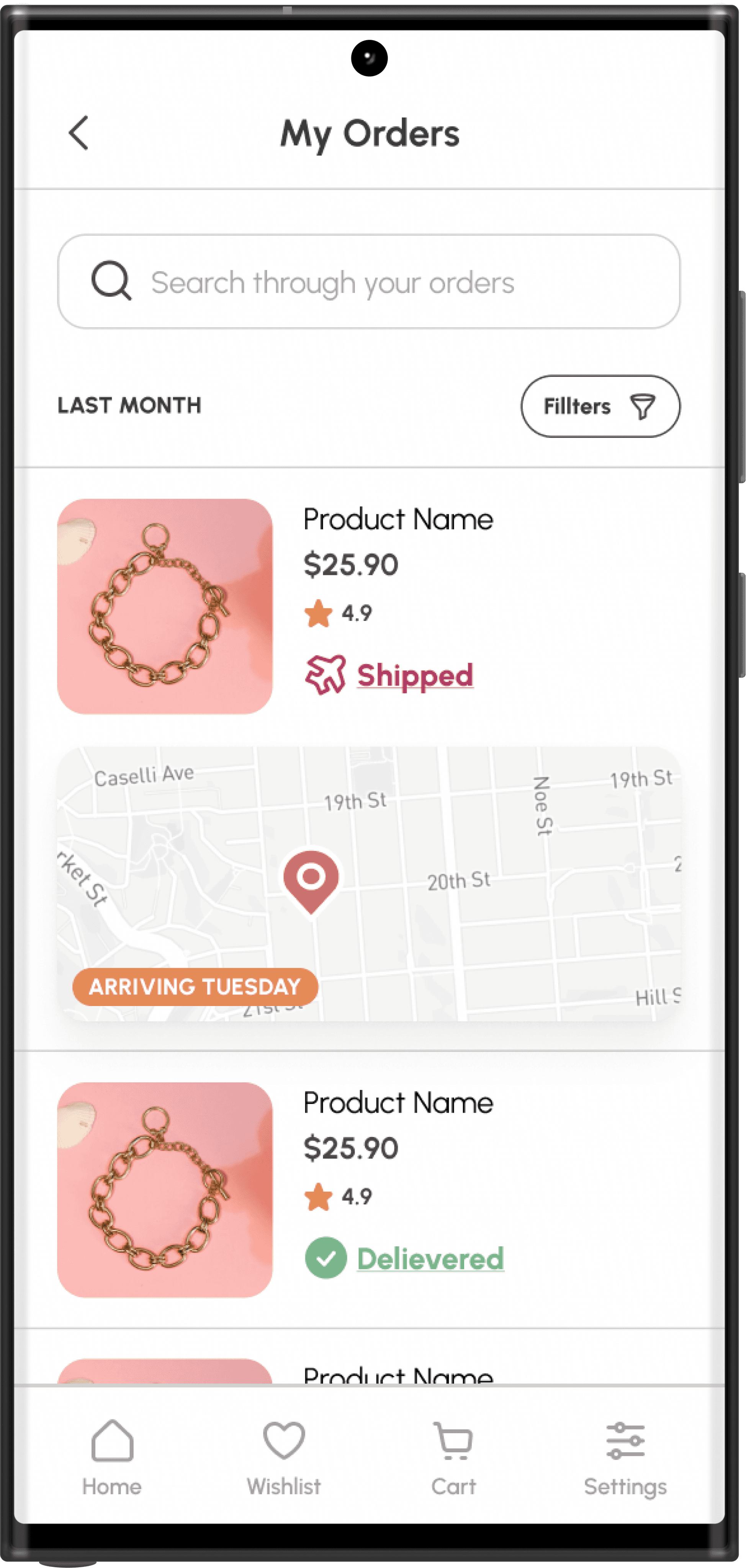
The low-fidelity wireframes depict the main functionalities of the app. The product page features big frames for recommended items based on user experience, allowing users to swipe through images of the jewelry. The "Add to Cart" button encourages users to explore more products. Reviews can be seen and written for each item. The app also includes a newsletter section for inspiration on how to combine jewelry.
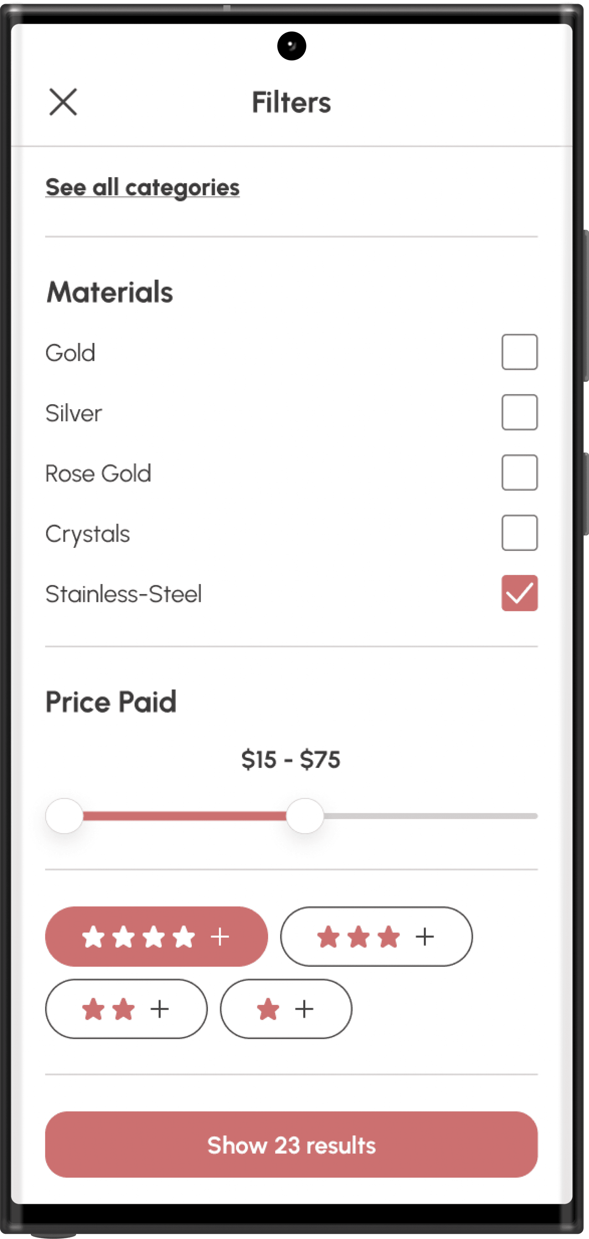
In the search results, users can apply filters and view suggested combinations of items. The wishlist allows for easy product management.
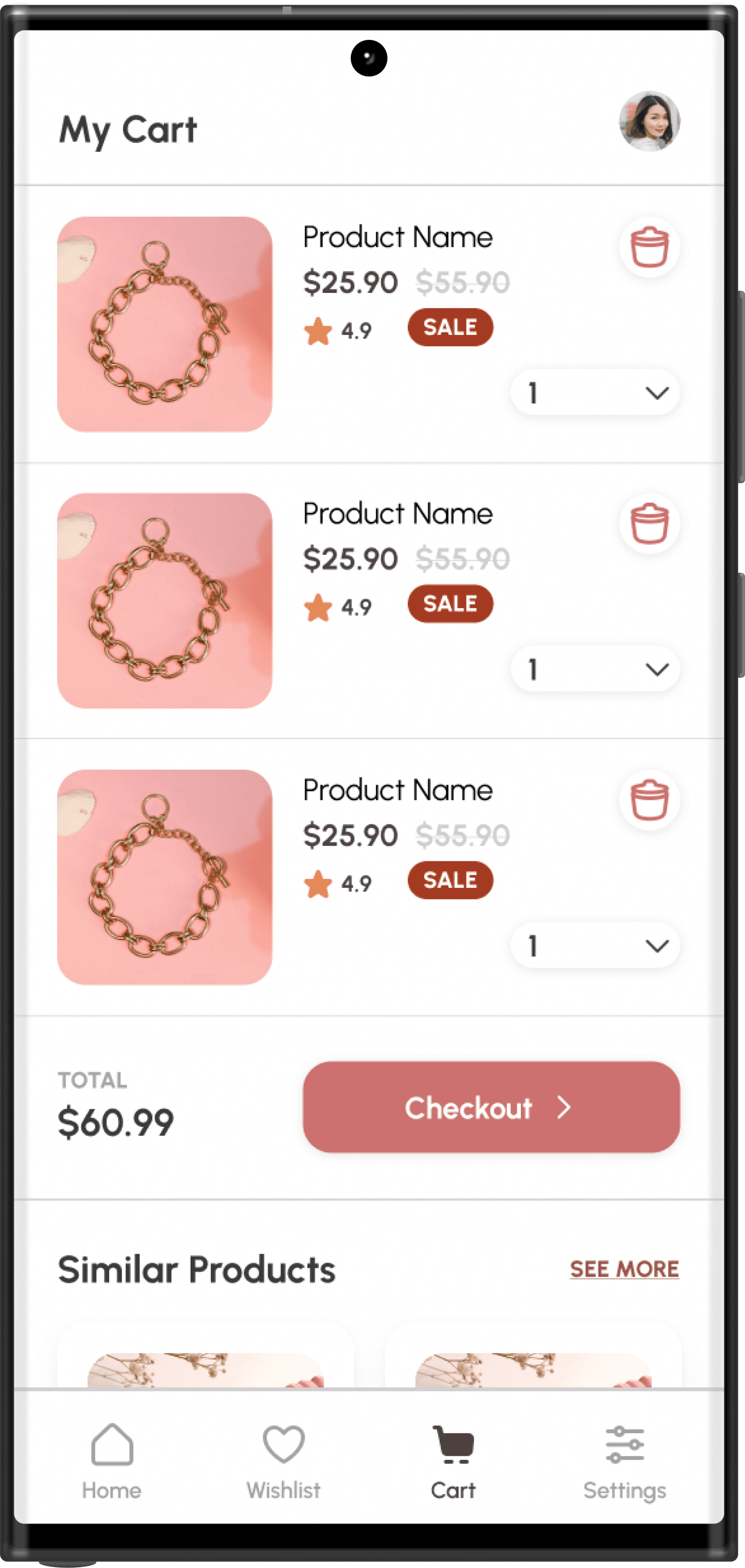
In the cart and checkout process, users can adjust product quantities, remove items, and review their order details. Changes in the payment UI design were implemented for a smoother final order process, and a section displaying similar products was added to encourage further exploration before completing the purchase.
Design System
The design system is one of the most important part of the design of an app. It represets the style and the feelings that the app is supposed to contribute with itself.
The chosen style for the final product contains a girly style with pastel colors and accents which corresponds with the main purpose of the app - to have a catchy design that grabs the user and keeps their attention.
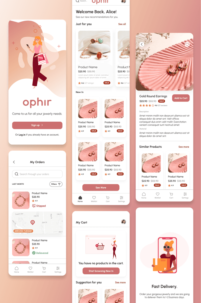
High-Fidelity Prototype
Based on the user research, the analysis and testing the final prototypes of the jewerly app were created.
Conclusion
Тhe app is perceived by testers as easy, accessible and eye-catching. Future development concepts are focused on adding more custom menu options as well as creating animations to accompany the unfolding actions.