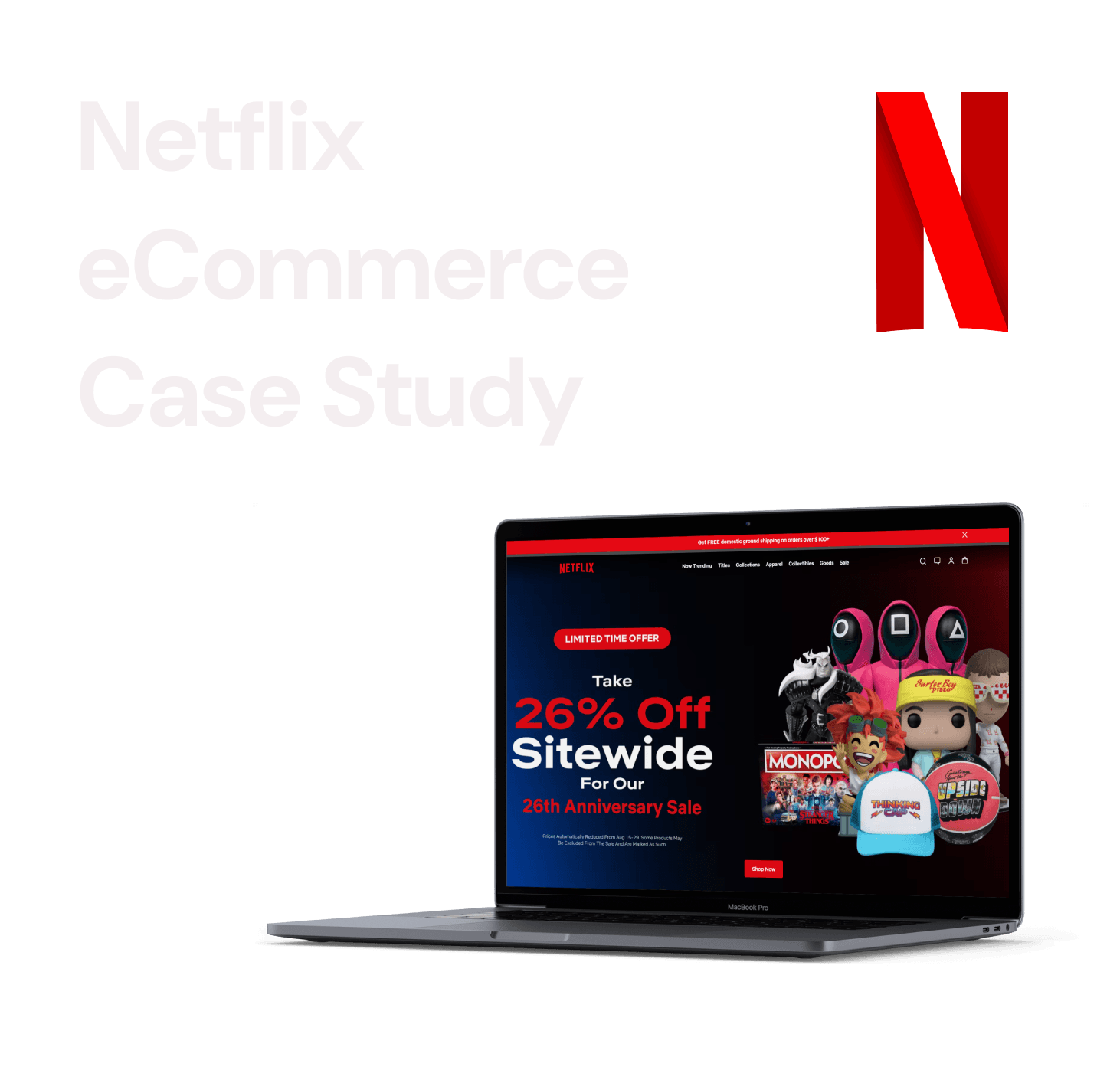
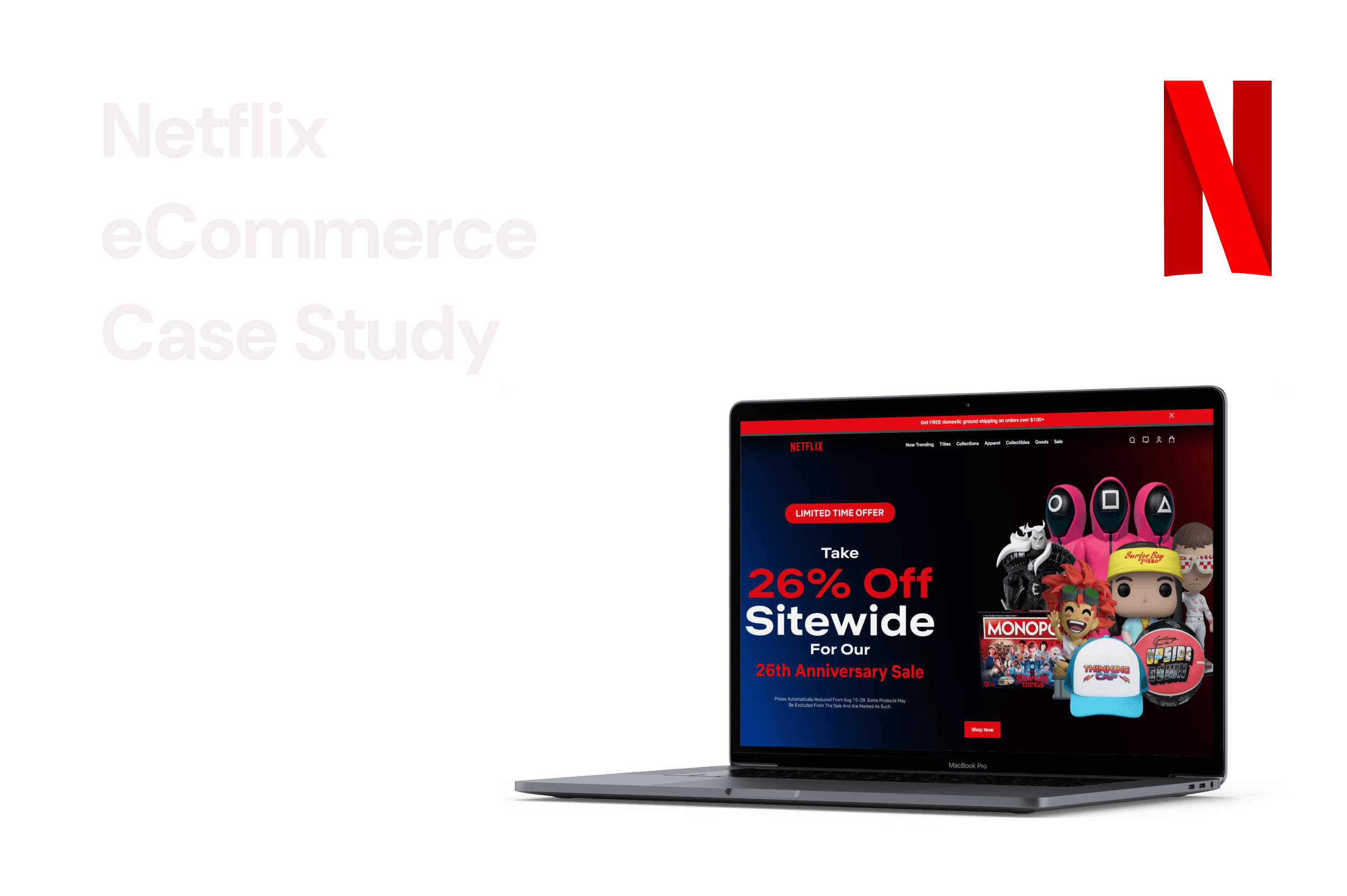
Netflix eCommerce Case Study
COMPANY
Netflix Store
ROLE
UX Designer
EXPERTISE
UXR & UXD
YEAR
2023
Introduction
Introduction
Introduction
Welcome to the official Netflix Shop, a destination that bridges the gap between on-screen enthusiasm and real-world expressions. Immerse yourself in a curated collection of merchandise inspired by beloved Netflix shows and movies, allowing your fandom to transcend the screen and become a tangible part of your everyday life.
The Problem
The Netflix Shop aimed to connect on-screen excitement with real-world merchandise inspired by Netflix content. However, purchases were slower than expected, and users encountered shopping issues identified through Usability Expert Review, User Journey Map and Task Analysis. As an UX Designer, my challenge now is refining the product for a better customer experience, focusing on a seamless user journey and higher satisfaction in the Netflix Shop.
The Process
The Process
The Process
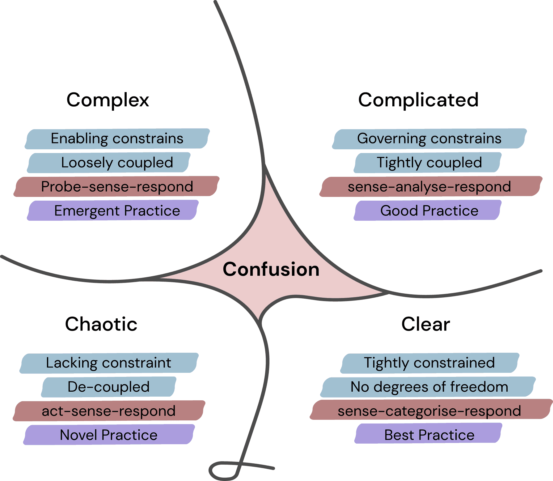
I've chosen to apply the Cynefin framework and the Double Diamond approach in my UX research because they provide a structured and comprehensive methodology for tackling complex design challenges. The Cynefin framework helps me understand the nature of the problem at hand, allowing me to choose the right tools and strategies. The Double Diamond framework guides me through the entire design process, from ideation to implementation, ensuring a user-centered and iterative approach to problem-solving. Together, these frameworks empower me to deliver effective and impactful UX solutions.

The Cynefin Framework
The Cynefin Framework
The Cynefin Framework
The Cynefin framework is a decision-making and problem-solving model that categorizes issues into five domains: Simple, Complicated, Complex, Chaotic, and Disorder. It helps individuals and organizations determine the appropriate approach and strategies based on the nature of the problem, promoting effective decision-making and problem-solving in various contexts.
The Cynefin framework is a decision-making and problem-solving model that categorizes issues into five domains: Simple, Complicated, Complex, Chaotic, and Disorder. It helps individuals and organizations determine the appropriate approach and strategies based on the nature of the problem, promoting effective decision-making and problem-solving in various contexts.
The Cynefin framework is a decision-making and problem-solving model that categorizes issues into five domains: Simple, Complicated, Complex, Chaotic, and Disorder. It helps individuals and organizations determine the appropriate approach and strategies based on the nature of the problem, promoting effective decision-making and problem-solving in various contexts.
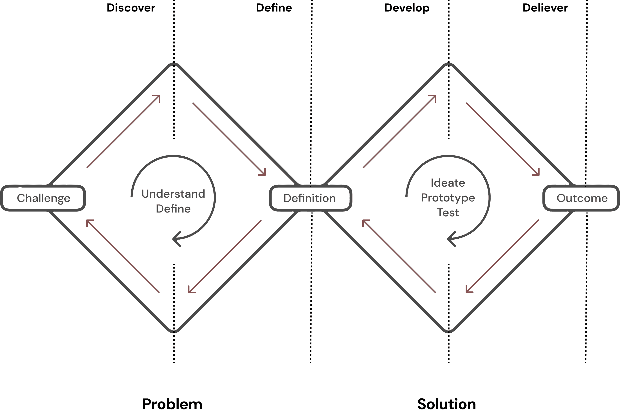
Double Diamond
Double Diamond
Double Diamond
The Double Diamond is a design thinking framework consisting of four distinct phases: Discover, Define, Develop, and Deliver. It is used to guide the design process by emphasizing empathy, ideation, prototyping, and iteration to create user-centered and innovative solutions.
The Double Diamond is a design thinking framework consisting of four distinct phases: Discover, Define, Develop, and Deliver. It is used to guide the design process by emphasizing empathy, ideation, prototyping, and iteration to create user-centered and innovative solutions.
The Double Diamond is a design thinking framework consisting of four distinct phases: Discover, Define, Develop, and Deliver. It is used to guide the design process by emphasizing empathy, ideation, prototyping, and iteration to create user-centered and innovative solutions.
Insights
Insights
Insights
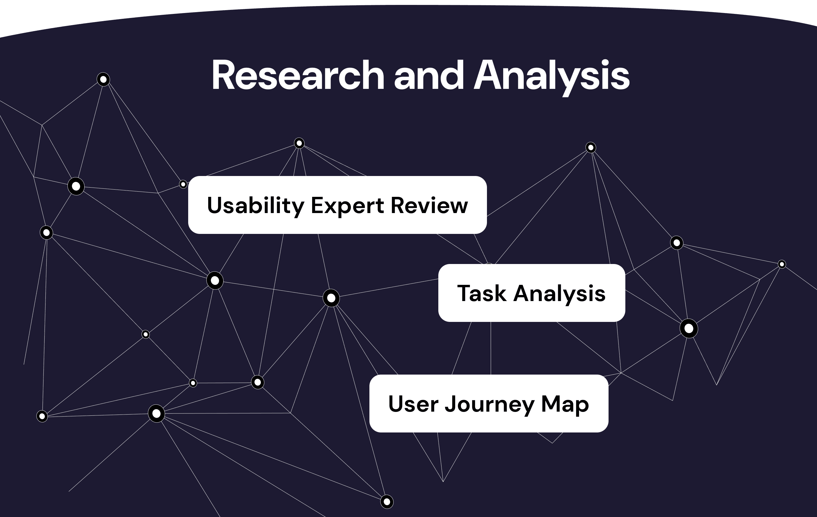
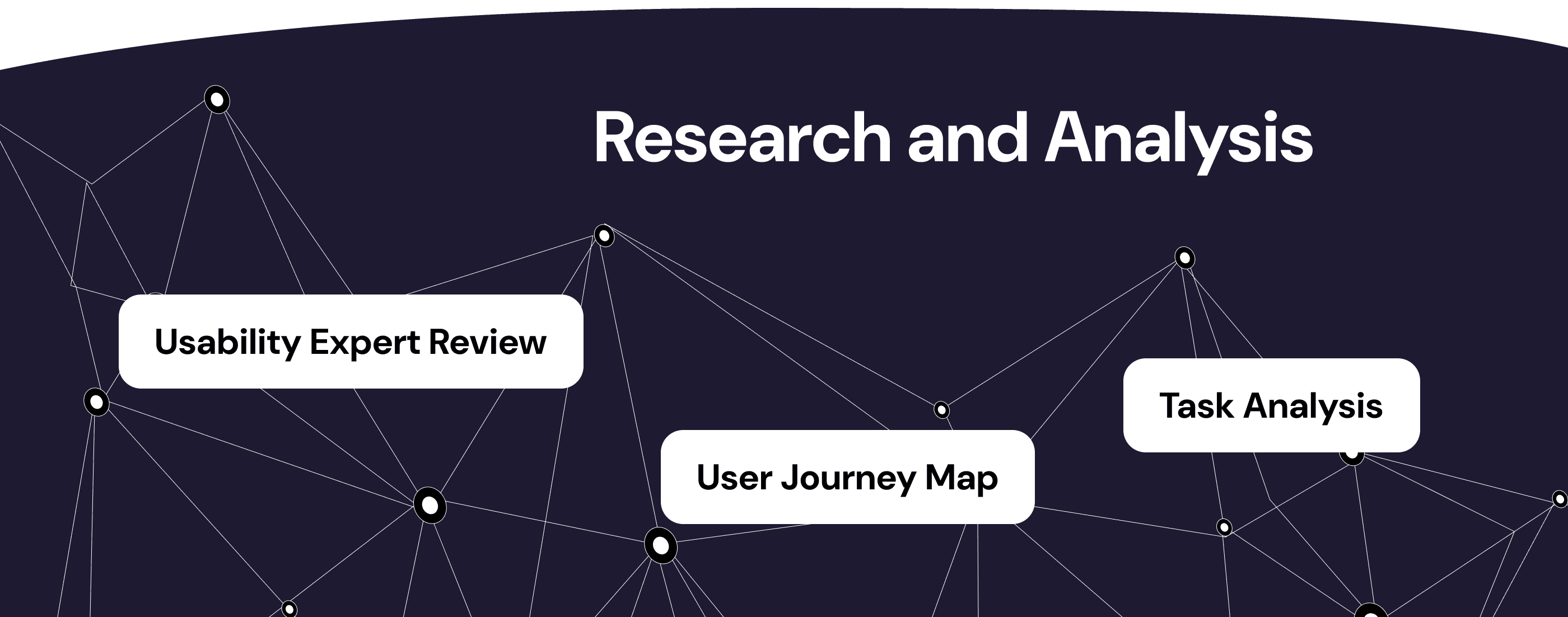
Utilizing the Cynefin framework, it was determined that the business challenge outlined in the statement falls within the "Complicated" category. Consequently, I opted to employ the Double Diamond framework, which comprises two key phases: Discovery and Implementation. Within the framework's spectrum of methodologies, I identified Usability Expert Review, User Journey Map and Task Analysis as my primary tools for the discovery phase.
In my role as a designer, I assumed the responsibility of orchestrating workshops and supervising all activities associated with this specific approach. This involved guiding the ideation process, iterating on concepts, and creating prototypes to address the complex problem at hand.
Usability Expert Review
Usability Expert Review
Usability Expert Review
Incorporating a usability expert review is essential to ensure a comprehensive evaluation of the platform's user experience. Usability experts possess the expertise to identify potential pain points, optimize user flows, and enhance overall user satisfaction. By engaging a usability expert, I aim to uncover valuable insights that will enable me to refine the website's design, navigation, and functionality, ultimately delivering a more seamless and enjoyable shopping experience for Netflix's customers.
Incorporating a usability expert review is essential to ensure a comprehensive evaluation of the platform's user experience. Usability experts possess the expertise to identify potential pain points, optimize user flows, and enhance overall user satisfaction. By engaging a usability expert, I aim to uncover valuable insights that will enable me to refine the website's design, navigation, and functionality, ultimately delivering a more seamless and enjoyable shopping experience for Netflix's customers.
Incorporating a usability expert review is essential to ensure a comprehensive evaluation of the platform's user experience. Usability experts possess the expertise to identify potential pain points, optimize user flows, and enhance overall user satisfaction. By engaging a usability expert, I aim to uncover valuable insights that will enable me to refine the website's design, navigation, and functionality, ultimately delivering a more seamless and enjoyable shopping experience for Netflix's customers.
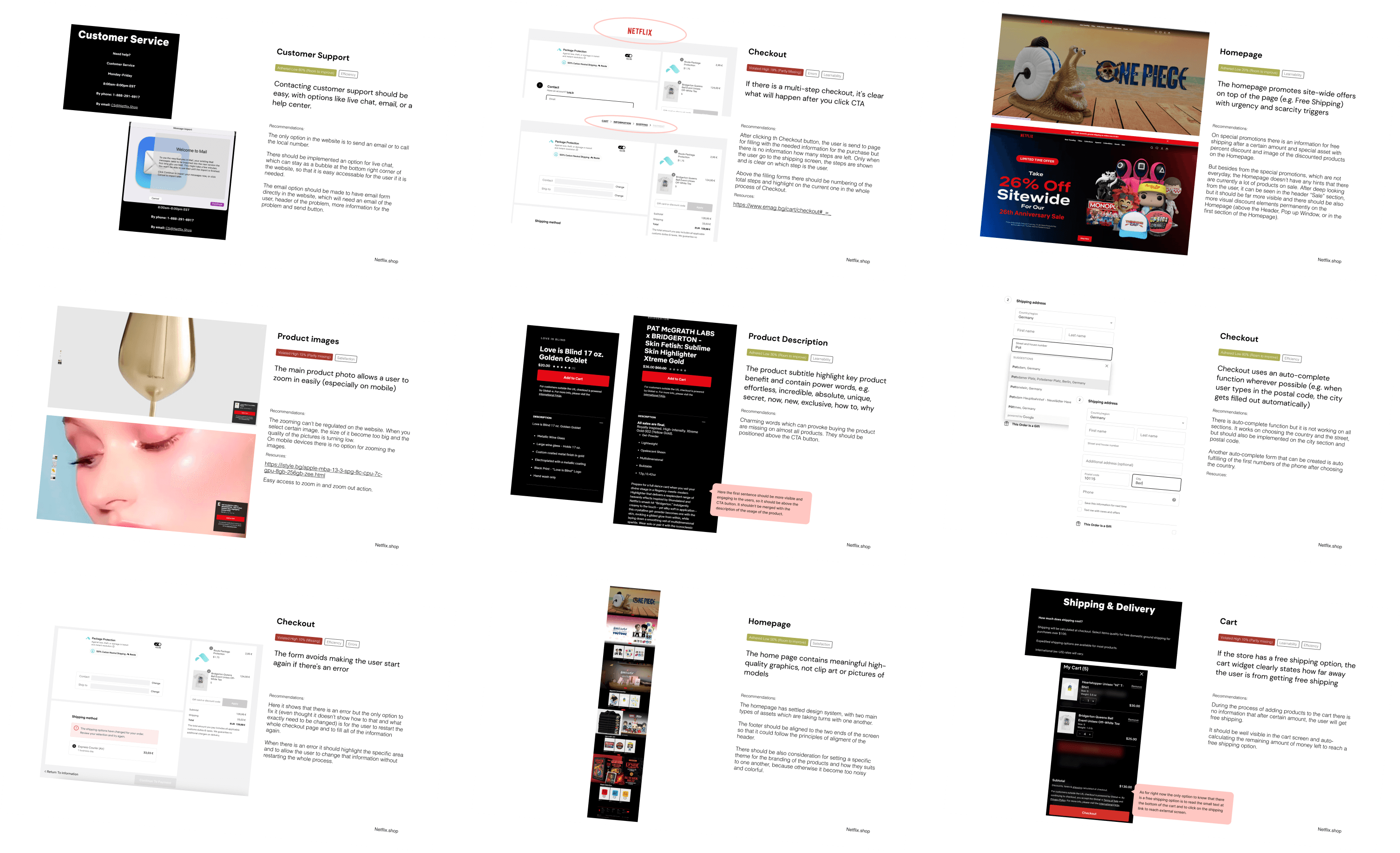
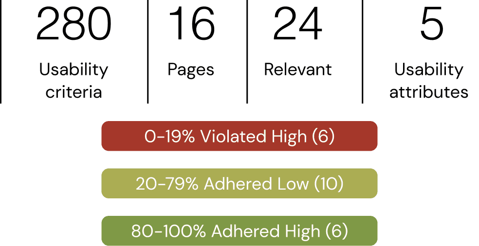
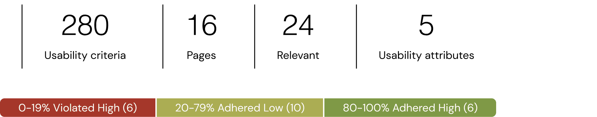
For my usability expert review of the Netflix.shop website, I employed a rigorous evaluation process consisting of 280 usability criteria. These criteria encompassed various aspects of user interaction, interface design, and functionality. To assess the website's performance, I employed a scoring scale that categorized each criterion into three levels: "highly violated" for scores between 0-19%, "low adherence" for scores ranging from 20-79%, and "high adherence" for scores in the 80-100% range. This granular scoring approach allowed me to precisely pinpoint areas of concern and excellence within the website.
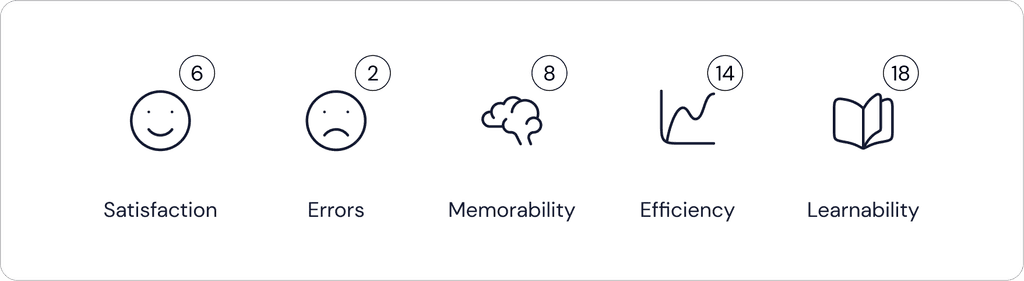
Furthermore, to organize and communicate my findings effectively, I categorized them into five key dimensions: satisfaction, errors, memorability, efficiency, and learnability. This categorization helped highlight specific strengths and weaknesses in each area, providing valuable insights for optimizing the user experience. By utilizing this comprehensive framework and scoring system, my usability expert review offers a holistic view of the Netflix.shop website's usability, facilitating targeted improvements to enhance user satisfaction and engagement on the platform.
For my usability expert review of the Netflix.shop website, I employed a rigorous evaluation process consisting of 280 usability criteria. These criteria encompassed various aspects of user interaction, interface design, and functionality. To assess the website's performance, I employed a scoring scale that categorized each criterion into three levels: "highly violated" for scores between 0-19%, "low adherence" for scores ranging from 20-79%, and "high adherence" for scores in the 80-100% range. This granular scoring approach allowed me to precisely pinpoint areas of concern and excellence within the website.
Furthermore, to organize and communicate my findings effectively, I categorized them into five key dimensions: satisfaction, errors, memorability, efficiency, and learnability. This categorization helped highlight specific strengths and weaknesses in each area, providing valuable insights for optimizing the user experience. By utilizing this comprehensive framework and scoring system, my usability expert review offers a holistic view of the Netflix.shop website's usability, facilitating targeted improvements to enhance user satisfaction and engagement on the platform.
Reviewed Pages
Reviewed Pages
Reviewed Pages
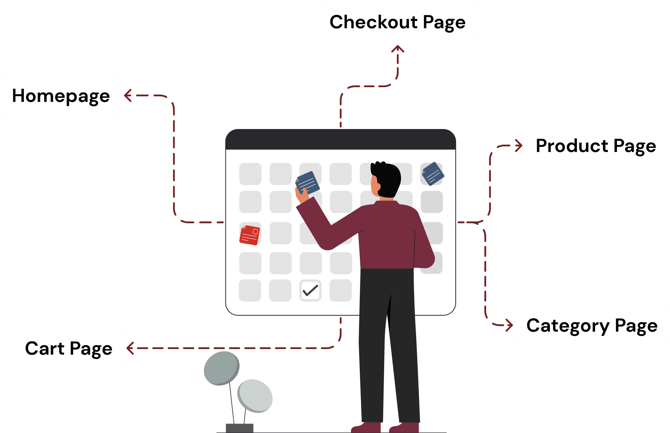
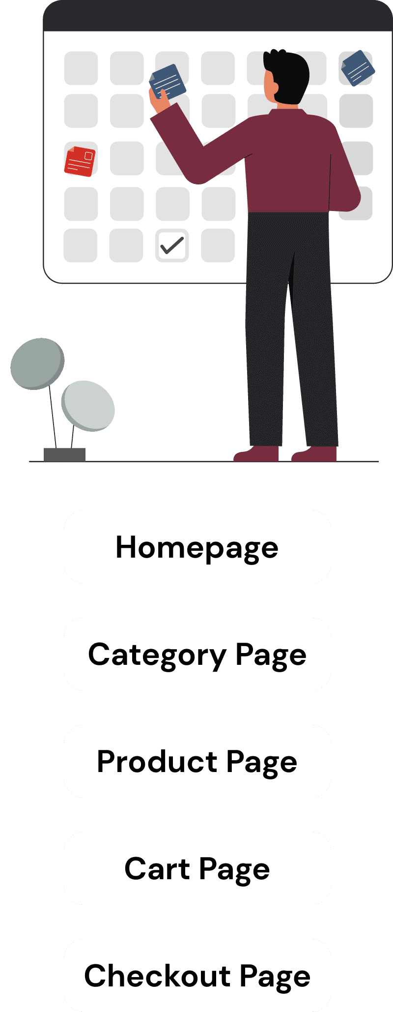
The website's design is slightly above the average, ensuring ease of access for all users with fast loading times and minimal errors.
However, there are UI inconsistencies in image sizing and alignment that need attention. More notably, the UX requires substantial rework, especially concerning cart options, filter menus, and product promotion, to enhance user satisfaction and usability.
Findings and insights
Findings and insights
Findings and insights
Usability assessment of Netflix shop, evaluating its website experience against 280 usability criteria and best practices.
Usability assessment of Netflix shop, evaluating its website experience against 280 usability criteria and best practices.
Usability assessment of Netflix shop, evaluating its website experience against 280 usability criteria and best practices.
The website's design is slightly above the average, ensuring ease of access for all users with fast loading times and minimal errors.
However, there are UI inconsistencies in image sizing and alignment that need attention. More notably, the UX requires substantial rework, especially concerning cart options, filter menus, and product promotion, to enhance user satisfaction and usability.
The findings revealed a generally high level of user satisfaction, with only six minor issues identified. While the website demonstrated strong performance in error reduction, two minor errors were detected. Memorability was reasonable, with eight areas for potential improvement, while efficiency displayed room for enhancement, with 14 identified areas. Notably, learnability emerged as a concern, with 18 findings indicating opportunities to make the platform more intuitive and user-friendly, particularly for first-time visitors. Addressing these issues will be crucial in optimizing the overall user experience and ensuring a seamless shopping journey on the Netflix.shop website.
The findings revealed a generally high level of user satisfaction, with only six minor issues identified. While the website demonstrated strong performance in error reduction, two minor errors were detected. Memorability was reasonable, with eight areas for potential improvement, while efficiency displayed room for enhancement, with 14 identified areas. Notably, learnability emerged as a concern, with 18 findings indicating opportunities to make the platform more intuitive and user-friendly, particularly for first-time visitors. Addressing these issues will be crucial in optimizing the overall user experience and ensuring a seamless shopping journey on the Netflix.shop website.
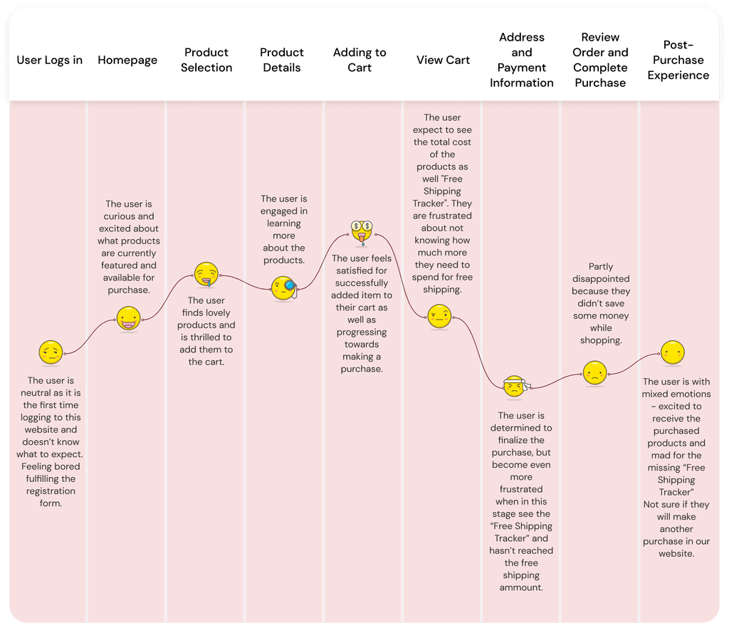
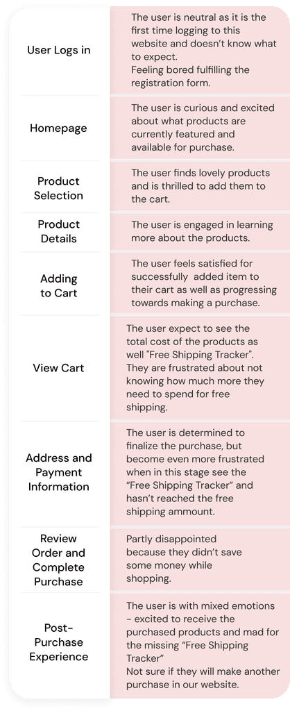
User Journey Map
User Journey Map
User Journey Map
The usability expert review has detected a critical issue: the absence of a "Free Shipping Tracker" in the cart. Currently, customers are not provided with information on how much more they need to spend to qualify for free shipping. This missing feature negatively impacts the overall shopping experience and affects the ability to drive higher AOV.
Presenting the user journey map is essential for addressing and improving the missing “Free Shipping Tracker” feature on the Netflix.shop website. By mapping the user's path, I gain valuable insights into their experience, allowing me to pinpoint precisely where and how this crucial feature can be integrated seamlessly.
Delights:
Smooth and user-friendly product selection and checkout process.
Clear product information and details.
Reassuring order confirmation and tracking.
Opportunities:
Address the frustration caused by the missing "free shipping tracker" in the cart.
Enhance user experience by providing real-time free shipping progress.
Improve communication about free shipping eligibility and potential additional costs.
Missing "Free shipping tracker" feature in the cart
Delights:
Smooth and user-friendly product selection and checkout process.
Clear product information and details.
Reassuring order confirmation and tracking.
Opportunities:
Address the frustration caused by the missing "free shipping tracker" in the cart.
Enhance user experience by providing real-time free shipping progress.
Improve communication about free shipping eligibility and potential additional costs.
The findings revealed a generally high level of user satisfaction, with only six minor issues identified. While the website demonstrated strong performance in error reduction, two minor errors were detected. Memorability was reasonable, with eight areas for potential improvement, while efficiency displayed room for enhancement, with 14 identified areas. Notably, learnability emerged as a concern, with 18 findings indicating opportunities to make the platform more intuitive and user-friendly, particularly for first-time visitors. Addressing these issues will be crucial in optimizing the overall user experience and ensuring a seamless shopping journey on the Netflix.shop website.
Missing "Free shipping tracker" feature in the cart
Missing "Free shipping tracker" feature in the cart
Delights:
Smooth and user-friendly product selection and checkout process.
Clear product information and details.
Reassuring order confirmation and tracking.
Opportunities:
Address the frustration caused by the missing "free shipping tracker" in the cart.
Enhance user experience by providing real-time free shipping progress.
Improve communication about free shipping eligibility and potential additional costs.
Potential Solutions
Potential Solutions
Potential Solutions
• Incorporating of a progress bar or indicator within the cart that visually shows users their current progress toward free shipping. This can include a graphical representation that fills up as they add more items to their cart.
• Offering a dedicated tool or feature where users can input their location and see the remaining amount required for free shipping eligibility. This can be accessible both in the cart and on the product pages and will be needed because of the different localisations of the users.
• Integrating algorithms to suggest complementary products based on the items already in the user's cart. This can help users discover relevant items they might want to add to reach the free shipping threshold.
• Emphasizing the benefits of free shipping on the cart page with a prominent CTA such as "Unlock Free Shipping" or "Add $X to Your Cart for Free Shipping." This directs users' attention to the goal.
Task Analysis
Task Analysis
Task Analysis
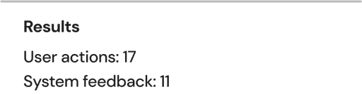
I use task analysis as a UX research method because it provides valuable insights into how users interact with a product or system. By breaking down complex tasks into smaller, manageable steps, I can understand the specific actions users take, their goals, pain points, and areas where they may struggle. This information helps me design more intuitive and user-friendly interfaces, streamline processes, and ultimately enhance the overall user experience. Task analysis allows me to align the design with user needs and preferences effectively.
The task that is going to be tested is “Using the search bar to find specific product and then adding it to cart”.
The goal is to identify how many steps are needed to complete the task and to see if there are any potential problems that can sabotage the process.
To make the test, the wanted task will be given to potential user who is using the Netflix.shop website for the first time. I will track the steps that he is taking and comparing them to the system answers.
The wanted results are to make the application more automate and to reduce the steps that are done by the user.
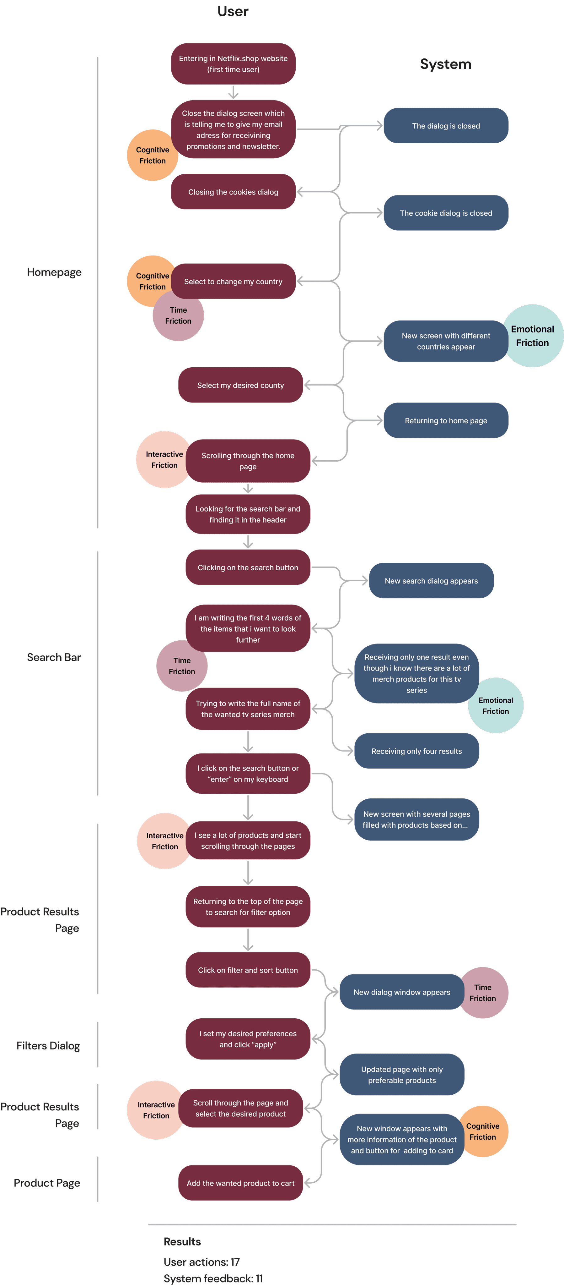
Based on the given results I should first focus on improving the suggested results while the user is in the search bar, so that the given confusion will be minimized.
Based on the given results I should first focus on improving the suggested results while the user is in the search bar, so that the given confusion will be minimized.
Based on the given results I should first focus on improving the suggested results while the user is in the search bar, so that the given confusion will be minimized.
Next Steps
Next Steps
Next Steps
Evaluating the success
In order to gauge the effectiveness of our findings, I propose establishing a framework to monitor the efficiency of the redesigned process using the following metrics:
• Rate of task success
• Frequency of errors
• Percentage of task completion
Designing high fidelity prototypes
Drawing upon the insights and suggestions outlined in this study, the next step is the creation of solutions (high-fidelity prototypes). These solutions are intended to furnish design deliverables to the engineering teams.
Conclusion
Conclusion
Conclusion
The key takeaways from the case study are:
Improvements Needed: There is a clear need for upgrades in the search bar navigation to enhance user experience.
UI Changes Necessary: Significant UI changes are required, particularly for product photos and descriptions, as these elements play a crucial role in user engagement.
Cart Options Enhancement: The cart options need improvement to make the shopping process smoother and more user-friendly.
Filling Out Cart Information: This optimization is critical for improving the overall user experience, reducing friction in the buying process, and increasing the likelihood of successful transactions.
The design research that I as a UX Designer conducted, had a substantial impact on the problem that was aimed to address. It provided deep insights into user behaviors, pain points, and needs. By implementing the findings and recommendations from the research, I was able to create a solution that was finely tuned to user preferences and requirements. This led to a marked improvement in the overall user experience, resulting in increased user satisfaction and engagement. The design research played a key role in transforming the problem into a well-informed and effective solution.
The key takeaways from the case study are:
Improvements Needed: There is a clear need for upgrades in the search bar navigation to enhance user experience.
UI Changes Necessary: Significant UI changes are required, particularly for product photos and descriptions, as these elements play a crucial role in user engagement.
Cart Options Enhancement: The cart options need improvement to make the shopping process smoother and more user-friendly.
Filling Out Cart Information: This optimization is critical for improving the overall user experience, reducing friction in the buying process, and increasing the likelihood of successful transactions.