Redesigning a Delivery Platform for a Seamless User Experience
ROLE
UX/UI Designer
EXPERTISE
UX/UI Design
YEAR
2024

This project involved redesigning an outdated logistics and delivery service website to create a modern, user-friendly platform aligned with current design standards and business goals. The primary objective was to enhance usability, encourage user engagement, and simplify the process of registering for the service. By introducing a new brand identity and cohesive visual language, the redesign aimed to communicate professionalism, trustworthiness, and efficiency while maintaining a clean and intuitive user experience.
The process involved in-depth research and analysis of user needs, strategic planning to align business goals with design objectives, and a structured approach to implementation for a seamless user experience.
Research & Analysis
The process began with an in-depth analysis of the existing platform and its user experience. A usability audit identified challenges such as confusing navigation, an overwhelming registration process, and a lack of clear branding. User behavior insights and market research on modern design trends informed the redesign approach, emphasizing intuitive navigation, clear CTAs, and a streamlined user journey.
Strategy & Planning
The strategy phase outlined a comprehensive roadmap for the redesign. Key priorities included establishing a new brand identity, improving the layout of essential information, and simplifying complex processes like registration and pricing. Each page was restructured to ensure clarity, consistency, and alignment with user needs and expectations.
Design & Implementation
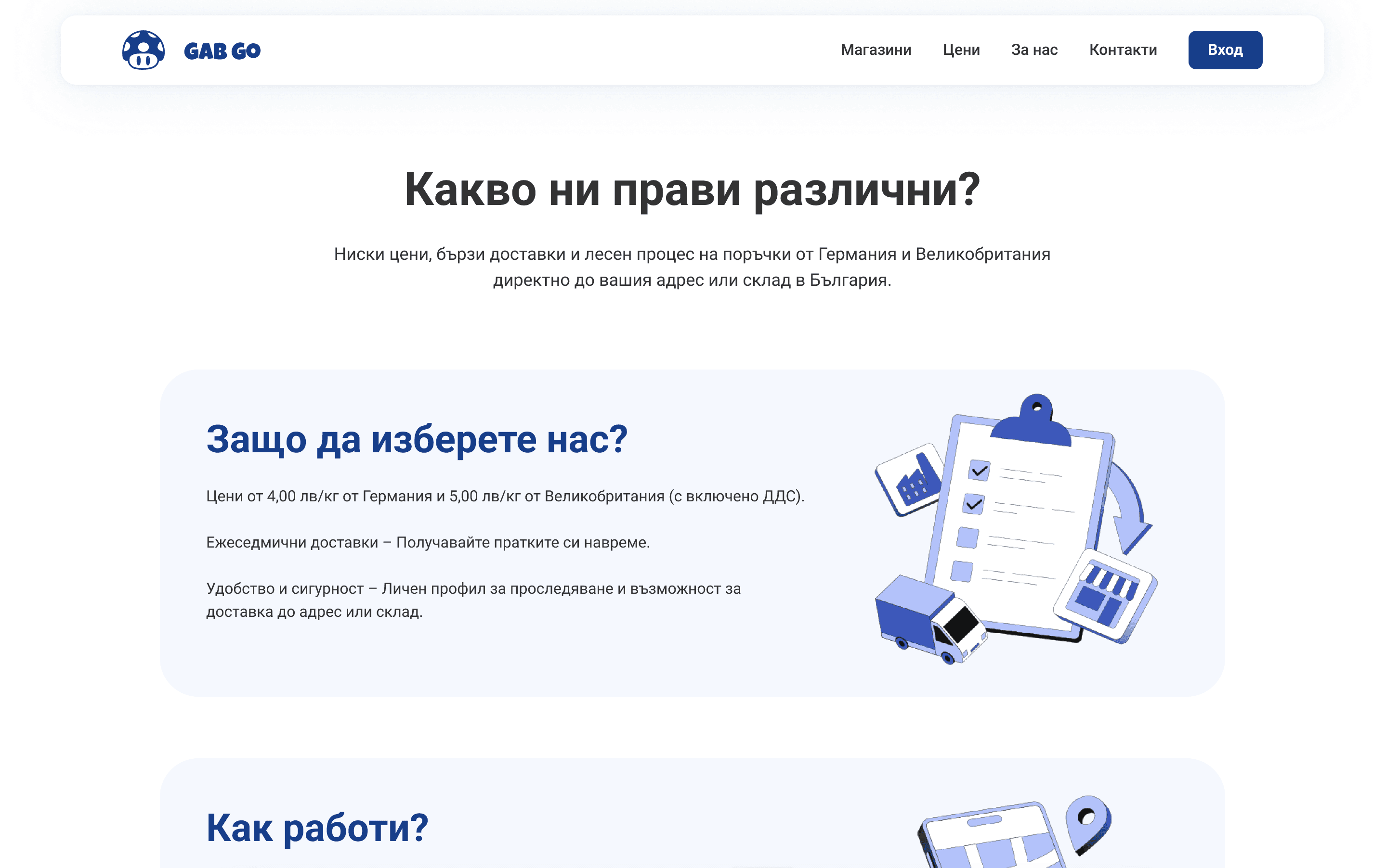
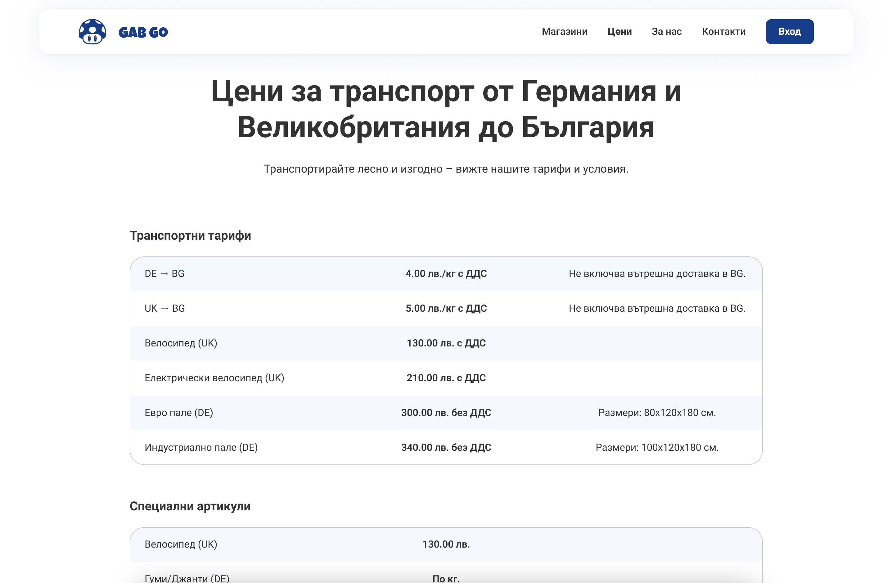
A fresh brand identity was developed, featuring a modern logo and a cohesive color palette centered around blue for brand recognition. The landing page was redesigned to introduce the company’s services effectively, with strategically placed CTAs to encourage registration. New layouts were implemented for all pages, including a visually engaging table on the Prices page, a clean showcase of featured stores in the Shops section, and streamlined forms in the Contact and Registration pages. Consistent design elements, such as icons, typography, and imagery, created a polished and unified user experience.
The solution focused on a comprehensive redesign, streamlining user experience, enhancing brand identity, and ensuring consistent, modern visuals across all website pages.
Brand Identity
A complete brand identity overhaul was carried out to modernize the website and establish a professional digital presence. A new logo was created to solidify brand recognition, and the color blue was retained as the primary brand color for consistency. The updated identity was applied across all design elements, ensuring a unified and recognizable appearance that aligns with the company’s values.
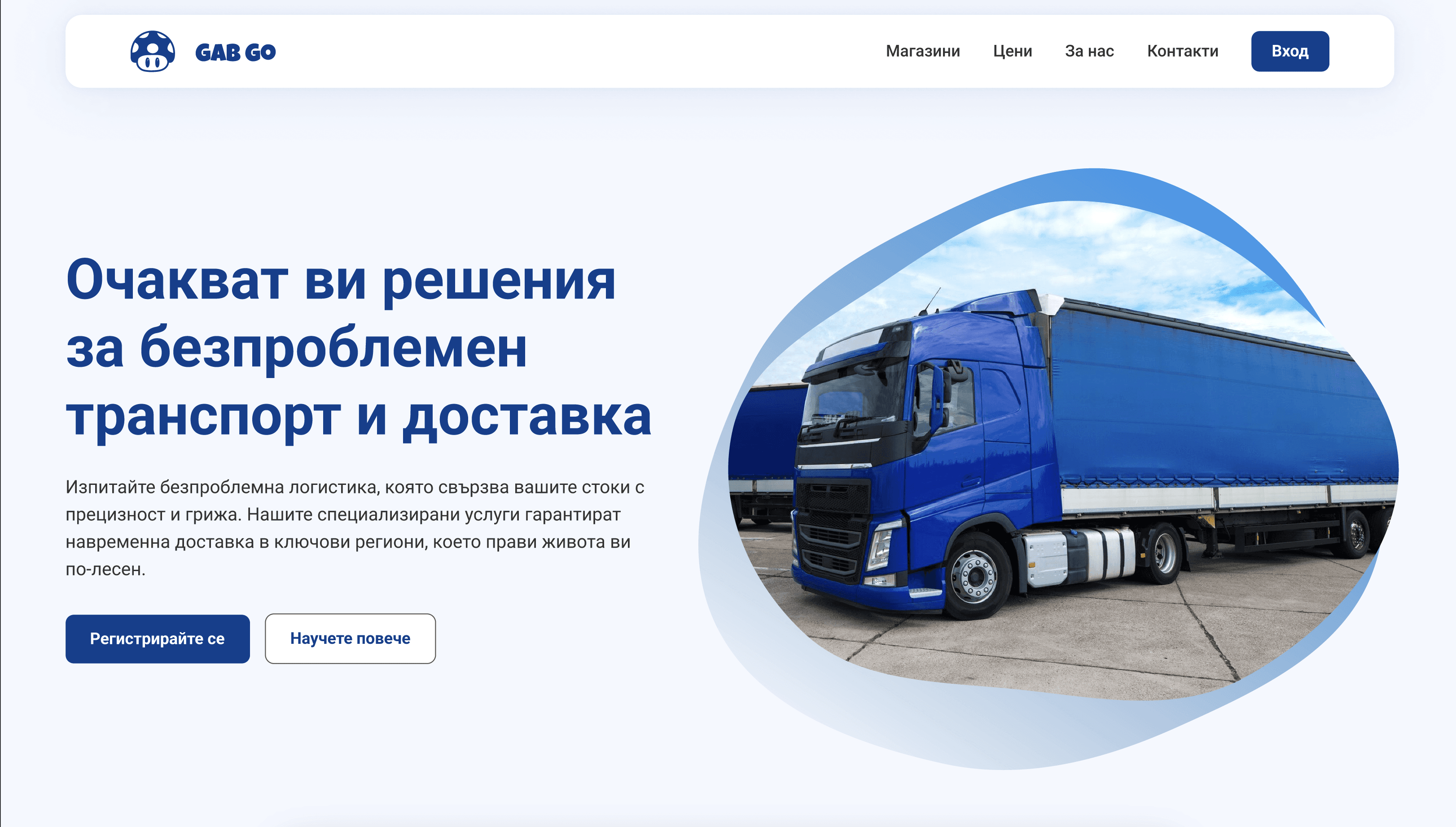
Landing Page
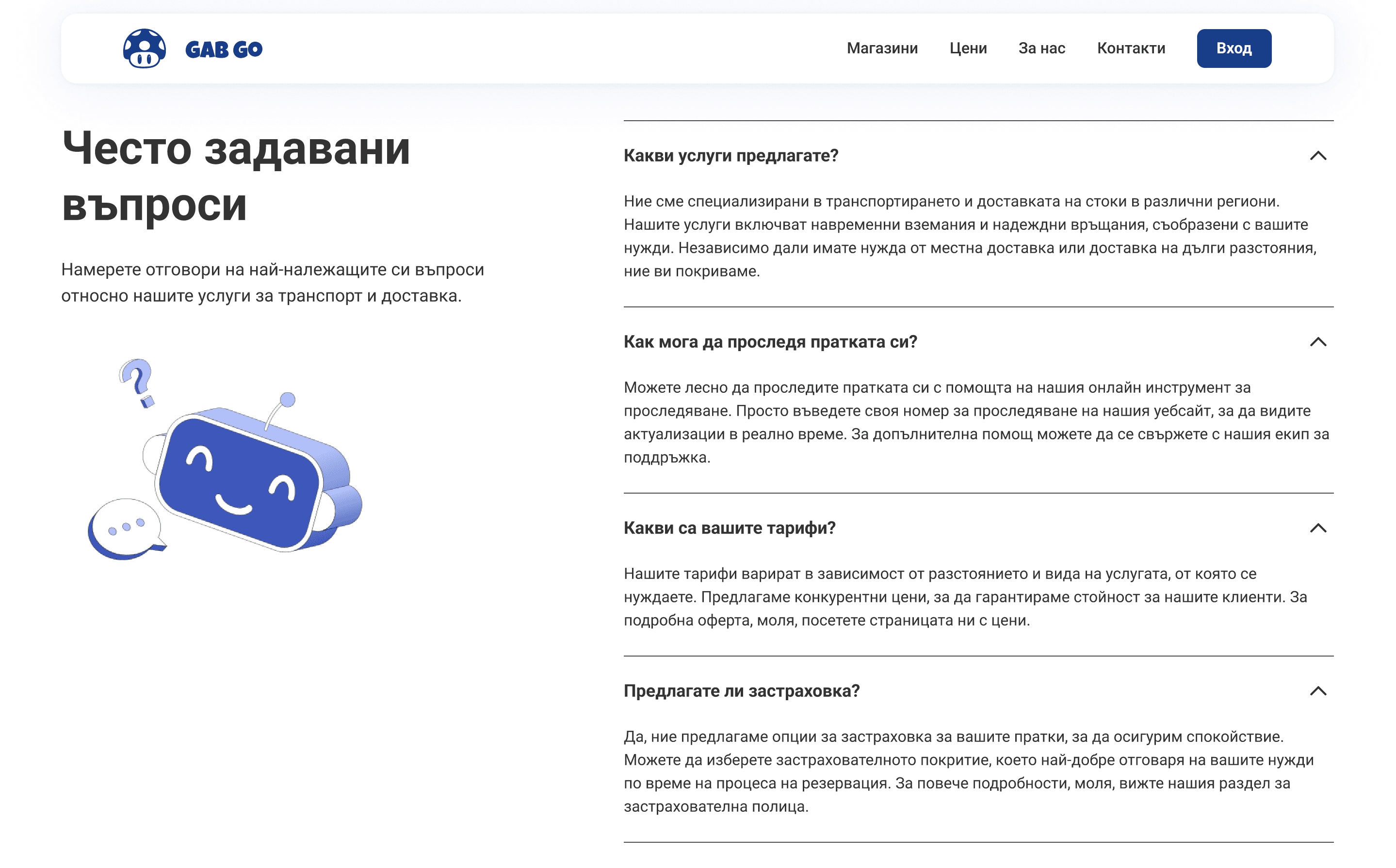
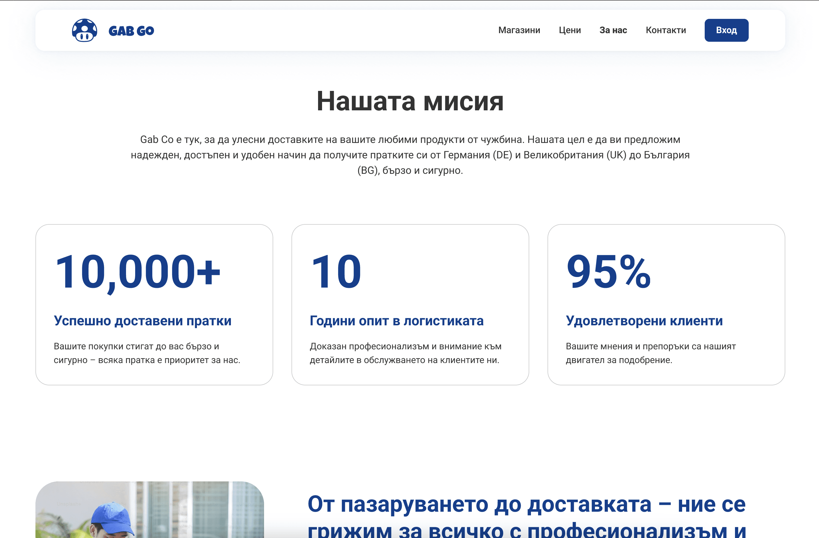
The new landing page was designed to immediately engage users with a clear introduction to the company’s services and purpose. Strategic CTA buttons were placed to guide users toward registration, emphasizing its importance for accessing the platform’s services. The page also features testimonials, a FAQ section, and a visually appealing footer with quick links, social media connections, and newsletter subscription options.
Individual Pages
Each page of the website was carefully redesigned for clarity and usability. The Prices page now features a structured table for easy comparison, with a CTA reinforcing the registration goal. The Shops page highlights frequently used stores in a clean format while maintaining user flexibility to shop elsewhere. The Contact page was updated to include a direct message form, essential contact details, and working hours, making it more functional and user-friendly.
Streamlined User Flow
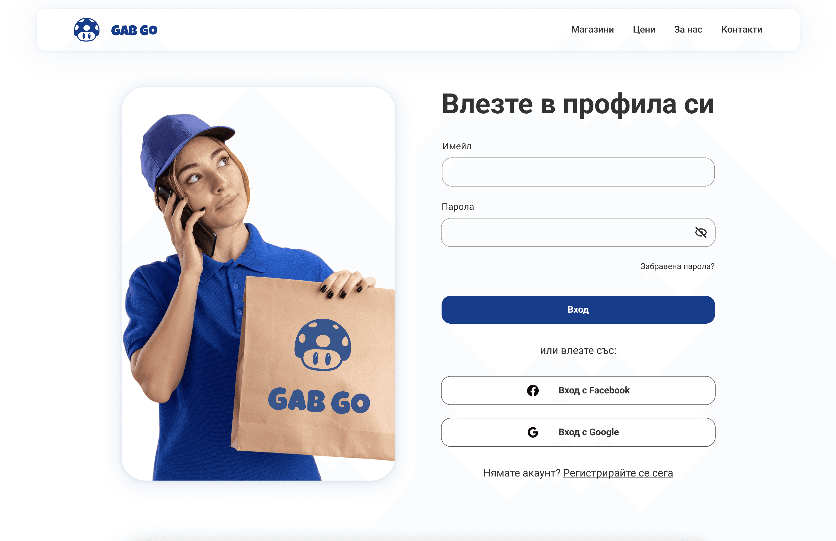
The login and registration processes were reimagined for simplicity, requiring only essential details initially, with options to add further information later. Social media login integration was added to enhance convenience. Users can easily switch between login and registration pages, reducing friction in the sign-up process.
Consistency Across Design
The entire website was unified with consistent typography, icons, and imagery, ensuring a seamless user experience. Every design element was purposefully crafted to align with the updated brand identity and promote trust, usability, and engagement.
The redesigned website delivers a seamless and engaging user experience, transforming the platform into a dynamic, user-friendly space. Clear navigation, a simplified registration process, and strategically positioned CTAs drive user engagement and conversions. The new design effectively communicates the company’s professionalism and values while ensuring the platform is aligned with both user expectations and business goals.